Ugly ads outperform beautiful ads for B2B lead generation because they look like organic posts, not advertising. Buyers have learned to skip anything that looks like an ad, so raw, high-contrast, text-heavy creative gets noticed, earns more clicks, and on Meta usually produces cheaper leads. Polished creative still has a place in retargeting.
Key facts
- Unpolished, UGC-style creative outperformed polished production by 31% on hook rate and 33% on click-through rate on Meta, in ad-software vendor Benly’s analysis of 12,347 ads across 842 ad accounts (Benly, 2026).
- In ad-analytics vendor Motion’s dataset of 550,000+ Facebook and Instagram ads, text-only ads had the highest hit rate of any format, 11.6% (Motion, 2026).
- The average cost per click for Facebook lead campaigns is $1.92 (WordStream), so ugly creative’s higher engagement compounds on a low cost base.
This guide draws on Peter Geisheker’s 20-plus years of B2B marketing experience as founder and CEO of The Geisheker Group, Inc., a fractional CMO firm serving B2B, B2B SaaS, and PE/VC-backed companies. Peter has personally managed more than $50 million in annual advertising spend, and the “ugly ads” approach described here is drawn directly from that work, not from theory. His career results include 6X inbound lead growth and a 77% reduction in paid acquisition costs. The recommendations below reflect direct-response campaigns run for B2B and B2B SaaS companies on Meta and LinkedIn, informed by 2026 creative-performance benchmarks from industry sources.
What Are Ugly Ads?
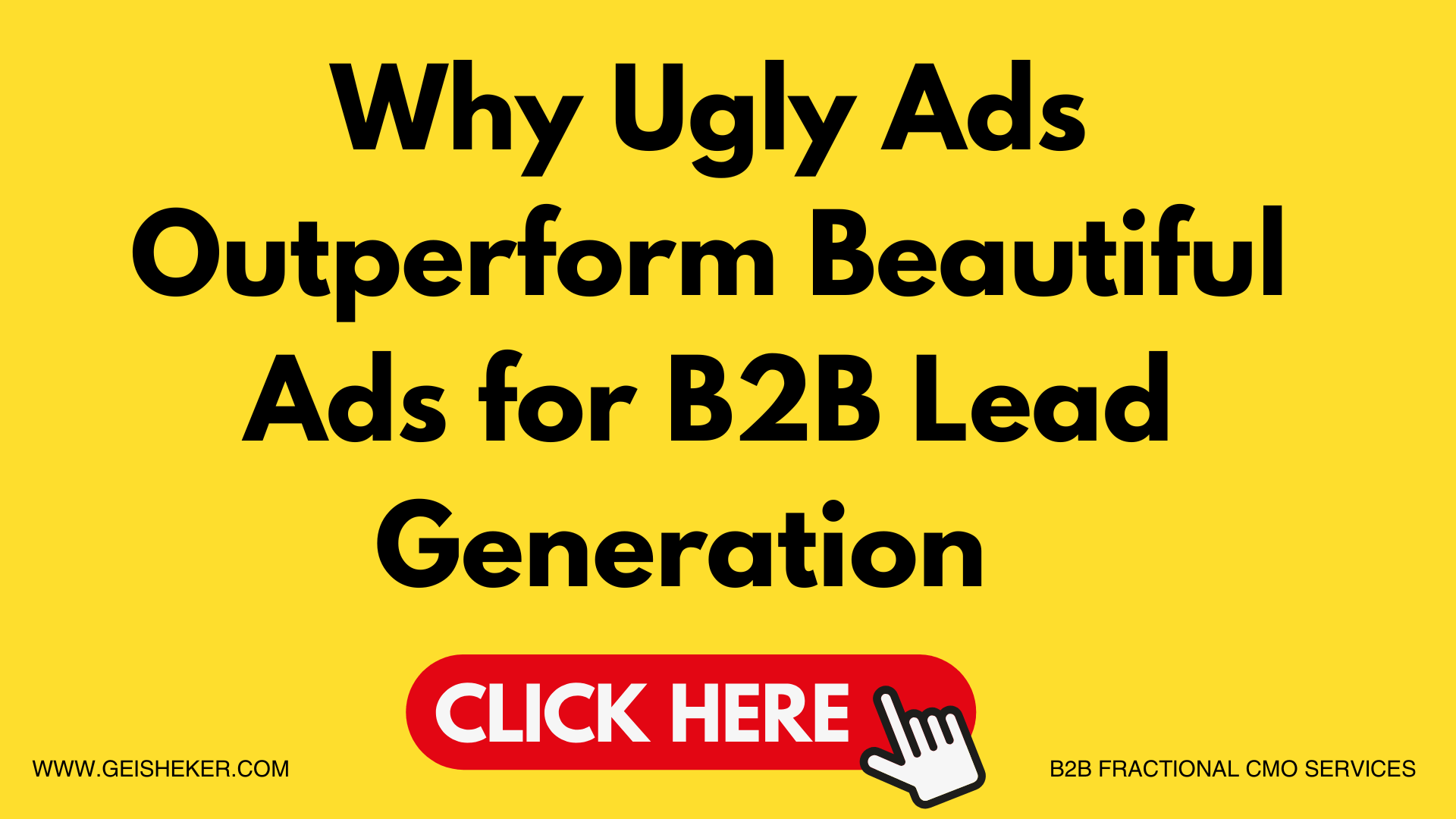
Ugly ads are ad creatives that intentionally break from polished, professional design to look like organic social content: bold, high-contrast visuals with a raw, unproduced feel, the kind of thing a real person would post rather than something a marketing department would sign off on. On Meta and LinkedIn, this look bypasses the trained ad-filtering behavior that causes users to ignore most professionally designed advertising, which produces higher engagement, more clicks, and better lead generation, especially for B2B companies. The hero image on this article is itself an example: a big black headline on a bright yellow background with a call-to-action button, the kind of ad that is impossible to not notice.
Your beautiful, on-brand, professionally designed ad is getting ignored. Your ugly one is generating leads. That sounds backwards, but after years of running B2B campaigns on Meta and LinkedIn I have watched it play out repeatedly, including one campaign where I nearly got fired for running an ad that looked like it took five minutes to make. It crushed everything else we were running.


Try two senior CMOs before you hire them
30 minutes with both of us. No hard sell. Written plan in 3 business days.
Why Are Polished B2B Ads Failing on Meta?
There is a term every digital marketer should know: banner blindness. It describes the well-documented phenomenon where users unconsciously ignore ads, not because they are indifferent, but because their brains have learned to filter out anything that looks like advertising. The Nielsen Norman Group first documented banner blindness in 1997, and its later eye-tracking research found that banner blindness is still a common behavior, even as web design and ad formats have evolved (Nielsen Norman Group).
For B2B marketers running Meta and LinkedIn campaigns, this creates an expensive problem. You can spend weeks crafting a beautiful ad: brand-compliant colors, polished photography, immaculate typography. Then the campaign launches and almost no one responds. The reason is not that your audience is indifferent to your offer. It is that your ad looks exactly like an ad, and users have built a near-automatic response to skip anything that pattern-matches to “corporate advertisement.”
The Ugly Ad That Nearly Got Me Fired
We had just finished a full round of professionally designed Meta ads for a B2B client. Weeks of creative development, brand-compliant colors, polished photography, clean typography. From a design standpoint, the ads were gorgeous. The results were essentially nothing.
Frustrated, I opened Canva and spent a few minutes building something completely different: an obnoxious bright yellow background, huge bold black text, zero design sophistication, the kind of thing that makes a graphic designer wince. I showed it to a colleague before launching, and her response was blunt: if this does not perform, you will be fired.
It performed. It crushed the beautiful ads on lead generation, and it kept outperforming every polished variant we tested against it. That reinforced something Peter Geisheker has since seen validated in B2B campaigns: on Meta and LinkedIn, good design is not about being pretty, it is about being noticed and getting results. Those are two different objectives, and confusing them is one of the most expensive mistakes B2B marketers make.
Why Do Ugly Ads Work? The Psychology and the Algorithm
The effectiveness of ugly ads is not a fluke; it is rooted in how attention works in information-saturated feeds and in how Meta’s algorithm distributes content.
When a user scrolls, their brain runs constant, unconscious pattern recognition, scanning for signals that say “content I chose to see” versus “an advertisement I should skip.” Highly polished creative, with consistent palettes, clean layouts, studio photography, and prominent logos, has become the clearest possible signal that something is an ad. The brain categorizes it and moves on, often before the user is consciously aware of having seen it. An ad with a bright, unexpected color, rough typography, and a casual presentation does not match that template. It reads like something a person posted, not a brand, and that moment of cognitive disruption is the opening that makes the ad work.
As e-commerce growth advisor Alexandra Greifeld has explained, an ugly ad is anything that looks like platform-native content, shot by a real person rather than a marketer, and ugly ads bypass the filter because we clock them as organic content (WordStream).
There is an algorithmic dimension on top of the psychology. Meta’s ad delivery runs on AI systems, including Andromeda, its personalized ads retrieval engine (Engineering at Meta), and those systems show more of the ads people actually engage with. In my campaigns, raw, unpolished content tends to earn comments, shares, saves, and clicks faster than polished brand creative, which gives the algorithm a reason to distribute it more widely. The broader creative data points the same way: unpolished UGC-style creative beat polished production by 31% on hook rate and 33% on click-through rate on Meta in an analysis of more than 12,000 ads (Benly, 2026).
Why Does This Matter Especially for B2B Companies?
Most B2B marketers operate under a specific pressure: everything must look professional, on-brand, and credible. The instinct is understandable when you are selling to business buyers rather than impulse purchasers. But your target buyer, the VP of Operations, the mid-market CEO, the Director of Technology, is not studying Meta ads in their office. They are scrolling the same feed as everyone else, on their phone, between meetings, with the same banner blindness as any other user. When they see a sleek, on-brand ad from a B2B company, their brain correctly identifies it as an advertisement and moves on.
They are absolutely on the platform. The question is how to reach them, and the answer is not to look like every other corporate brand they automatically filter out. The B2B opportunity is larger precisely because so few B2B brands run ugly creative; most of them run polished, on-brand creative that banner blindness quietly erases.
What Three Jobs Does Every Ugly Ad Have to Do?
Over years of testing ugly ads for B2B clients, Peter Geisheker has found that every winning ugly ad does three jobs: it interrupts, it engages, and it converts. Understanding the purpose of each is how you avoid the most common ugly-ad mistake: confusing “ugly” with “thoughtless.”
Interrupt means the ad visually stops the scroll. This is where the design choices live: the obnoxious background color, the oversized text, the rough-around-the-edges look that signals “this is not a normal ad.” It does not need to be pretty, it needs to be unexpected. A bright yellow background in a feed full of blue-and-white brand creative is unexpected. A photo that looks like it was taken on a phone is unexpected. Bold text filling 80% of the image is unexpected.
Engage means the message connects to something your buyer actually cares about right now. This is where ugly ads fail even when they interrupt successfully. “Schedule a Demo” after stopping someone is not engaging. Naming a specific frustration is: “Still losing deals because your marketing strategy is six months behind your sales team?” forces the reader to recognize themselves in the message.
Convert means one clear, low-friction next step: a lead form, a landing page with a specific offer, or a free consultation. The ugliness should never extend to an ambiguous call to action.
This approach does not ask you to abandon marketing fundamentals. It asks you to apply them in a visual context where ugly is a strategic asset, not a shortcut.
What Makes an Ugly Ad Work, and What Kills It?
Ugly creative is not the same as bad creative. As Greifeld has noted, the key is making content that feels authentic and does not feel overproduced, so it looks like something a real person would post rather than something out of a marketing department (WordStream).
Elements that consistently drive ugly-ad performance in B2B:
- Solid, high-contrast background colors (yellows, oranges, reds) that have no place in a brand style guide
- Text-heavy creative where the copy does the heavy lifting; in Motion’s 2026 benchmark data, text-only ads had an 11.6% hit rate, the highest of any format (Motion, 2026)
- Casual, first-person language that sounds like a person talking, not a company broadcasting
- Founder or team photos that look candid rather than staged headshots
- User-generated formats: screenshots, testimonials in a text-message layout, handwritten-style notes
- Meme-adjacent layouts whose visual structure itself triggers the brain’s “this is content, not advertising” recognition
Elements that tend to undermine ugly-ad performance:
- Brand logos placed prominently, which immediately signals “advertisement”
- Stock photography with perfect lighting and posed, smiling professionals
- Taglines that sound written by a marketing committee
- Color palettes that look intentionally designed and on-brand
- Copy in the formal third-person voice of a corporate announcement
The core principle: if it looks like something your marketing team would approve without hesitation, it is probably too polished to work as an ugly ad.
How Do You Test Ugly Ads the Right Way?
Before committing to ugly creative as your primary Meta strategy, run structured A/B tests against your existing polished creative. Run both types simultaneously to the same audience for at least two weeks with equal budget. In a Meta testing ad set, Peter Geisheker typically builds five ugly ads against five polished ads, and tracks not just click-through rate but cost per lead and, critically, lead quality: how many of those leads become qualified sales opportunities.
In most B2B campaigns Peter Geisheker has run, ugly ads win on cost per lead and on lead quality, because the direct, conversational tone attracts buyers who are further along in their decision and ready to engage. Greifeld’s caveat applies: ugly ads do not always perform; you still have to convert that extra attention with good content (WordStream). Ugly creative that captures attention and then delivers a weak offer will lose to polished creative with a compelling one.
Two 2026 realities should shape how you test. First, volume is a lever in its own right: in Motion’s analysis of more than 550,000 Meta ads, advertisers that launch more ads get more winners (Motion, 2026), so test more variations, not fewer. Second, if you want the ad’s leads to actually close, make sure you are also A/B testing your landing pages; the ugliest, highest-performing ad in the world is wasted on a page that quietly kills the lead.
Do Ugly Ads Hurt Your Brand?
The most common pushback from B2B marketing leaders is a brand concern: we cannot put something ugly into the market, what does it say about us? This reflects a misunderstanding of what an ugly ad does. Your ugly ad is not defining your brand; it is getting the right person to stop scrolling long enough to encounter your message. The landing page, the consultation call, the follow-up sequence: those define your brand. The ugly ad is the hook that starts the conversation.
The honest, data-backed version of the answer is a hybrid, not a purity test. In Benly’s 2026 benchmarks, top-performing accounts run approximately 60% UGC-style and 40% polished creative, and that blend typically outperforms a UGC-only or polished-only strategy by 18 to 25% on blended ROAS (Benly, 2026). Ugly ads carry top-of-funnel prospecting, where you are interrupting a cold audience; polished creative earns its place in retargeting, where the audience already knows you and trust is the conversion variable. The most polished ad in the world is worthless if no one looks at it. An ugly ad that gets looked at, delivers a message that resonates, and drives a qualified click is doing exactly what advertising is supposed to do. The question is not whether your ad is beautiful; it is whether it is noticed.
Frequently asked questions
What exactly are ugly ads?
Ugly ads are ad creatives that intentionally break from polished, professional design to look like organic social content: bold, high-contrast visuals with a raw, unproduced aesthetic, the kind of thing a real person might post rather than a marketing department. The goal is to bypass the trained ad-filtering behavior that causes users to ignore most professionally designed advertising.
Do ugly ads really work for B2B companies?
Yes, and often more effectively than polished creative. B2B buyers scroll the same feeds as everyone else and carry the same banner blindness.. Unpolished, UGC-style creative beat polished creative by 31% on hook rate and 33% on CTR on Meta across more than 12,000 ads (Benly, 2026), which shows up as higher click-through and lower cost per lead in many B2B campaigns.
Will ugly ads damage my B2B brand?
Not if deployed correctly. The ugly ad is an interruption mechanism; its job is to stop the scroll and get a qualified prospect to engage. Your brand is defined by what happens after the click. In practice the strongest approach is a blend, roughly 60% ugly for prospecting and 40% polished for retargeting, which outperforms either extreme on blended ROAS (Benly, 2026).
How much does it cost to run ugly ads on Meta versus LinkedIn?
The creative itself is cheap; you can build an ugly ad in Canva in minutes. On media cost, Facebook lead campaigns average $1.92 per click (WordStream). Because ugly creative lifts click-through on top of Meta’s already low base cost, the lead-generation economics usually favor testing there first.
How ugly is ugly enough?
Start with a high-contrast background color that has no place in your brand guide (bright yellow, orange, or red); add large bold text filling most of the image; use casual, direct, first-person language; and drop your logo, stock photography, and anything that looks intentionally designed. Test against your current creative with equal budget for at least two weeks. If it outperforms, push further. Bold black, red, or blue text on a plain white background is another format Peter Geisheker has used to crush campaigns.
Should I stop running polished ads entirely?
No. The 2026 data favors a hybrid: ugly creative for top-of-funnel prospecting against cold audiences, polished creative for retargeting audiences who already know you, with the blend outperforming either extreme (Benly, 2026). Test both, measure cost per qualified lead rather than cost per click, and let the data set the allocation.
Can I use ugly ads for B2B SaaS companies?
Absolutely. B2B SaaS companies are among the strongest candidates for ugly creative on Meta. The key is specific problem framing: not “we help teams collaborate better” but “your sales team is losing deals while your marketing is still figuring out the strategy.” The more precisely the ad names a frustration the buyer is living with, the better it performs, regardless of how raw the visual is.
How do I know if my ugly ads are generating quality leads?
Track conversion beyond the click; measure how many Meta leads become qualified sales opportunities. Ugly ads should lower cost per lead, and in well-built campaigns those leads are of comparable or better quality because the direct tone attracts genuinely interested buyers. High volume with low quality points to the targeting and the offer, not the creative format.
Putting Ugly Ads to Work in Your B2B Marketing
Most B2B teams understand the logic of ugly ads the moment they read it. The harder problem is running the system: building a steady stream of ugly variations, structuring the A/B tests against polished creative with equal budget, wiring the leads to a landing page that actually converts, and reading cost per qualified lead rather than vanity clicks so you know what is really working.
That installation work is fractional CMO work. If your team is capable but has not built a direct-response Meta system before, that gap is what a B2B fractional CMO is for. A typical engagement here involves auditing your current paid-social creative and testing discipline, building the ugly-ad testing system, aligning the ads with precision ICP targeting and a landing page built to convert, and standing up the cost-per-qualified-lead measurement that tells you where to scale.
If your company already has an in-house paid-social lead who has run structured creative testing at volume before, you may not need outside help. If your situation is the common one (strong team, no one who has built this specific system), a short conversation will tell us whether it is something we can help with.
The Bottom Line on Ugly Ads
The most dangerous assumption in advertising is that looking professional equals performing professionally. A beautifully designed ad that no one looks at has a conversion rate of zero. An ugly ad that stops the scroll, delivers a message that resonates, and drives a qualified prospect to act is doing exactly what advertising is supposed to do. In 2026, with UGC-style creative beating polished production on both hook rate and click-through, this is not a fringe tactic; it is one of the biggest levers in paid social.
Build one ugly ad in Canva this week: obnoxious background color, big bold text, a direct message that names a real pain your buyer is living with. Test it against your best polished ad with equal budget for two weeks. There is a reasonable chance it outperforms everything else you are running. And if you want help building a B2B marketing strategy that generates consistent, qualified leads across every channel, not just Meta, book a free 30-minute growth plan session with me and Michael Pecora. No hard sell, and you get a written growth plan within 3 business days. We take 10 companies a month.
About Peter Geisheker
Peter Geisheker is a fractional CMO and founder and CEO of The Geisheker Group, Inc., specializing in B2B and B2B SaaS fractional CMO services. He has managed more than $50 million in annual advertising spend.. With decades of experience helping companies build marketing systems that generate measurable revenue growth, Peter provides senior-level expertise across paid social strategy, lead generation, and content marketing without the full-time executive cost.
Free Written Growth Plan
Wondering if a fractional CMO is right for you?
Try us before you hire us. Book a free 30-minute working session with both of us and get a written growth plan you can use whether or not you hire us.
Get My Free Growth Plan →No hard sell on the call. Your plan arrives within 3 business days. See a sample plan
Sources
- Benly, Ad Creative Benchmarks 2026
- Motion, Creative Benchmarks 2026
- WordStream, Facebook Ads Benchmarks 2025
- Nielsen Norman Group, Banner Blindness Revisited: Users Dodge Ads on Mobile and Desktop
- WordStream, 7 Best Facebook Ads Tactics from Demand Generation Pros
- Engineering at Meta, Meta Andromeda: Supercharging Advantage+ automation with the next-gen personalized ads retrieval engine